
Nothing has never been a brand that blends quietly into the background. From its transparent design language to its unconventional marketing style, the company has built its identity around standing apart in a market filled with predictable smartphones.
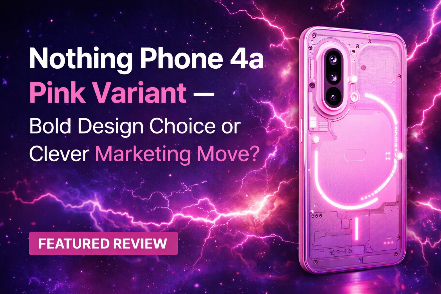
With the upcoming launch of the Nothing Phone 4a, the brand has once again captured attention — this time by introducing a pink variant, marking the first time Nothing has ventured into this colour territory for its smartphones.
At first glance, this might seem like a simple cosmetic update. After all, smartphone manufacturers release new colours regularly. But with Nothing, design decisions rarely feel accidental.
So the real question becomes:
Is the pink variant a bold design evolution, or is it a smart marketing strategy designed to generate buzz? Let’s take a deeper look.
A Colour Announcement That Sparked Conversation
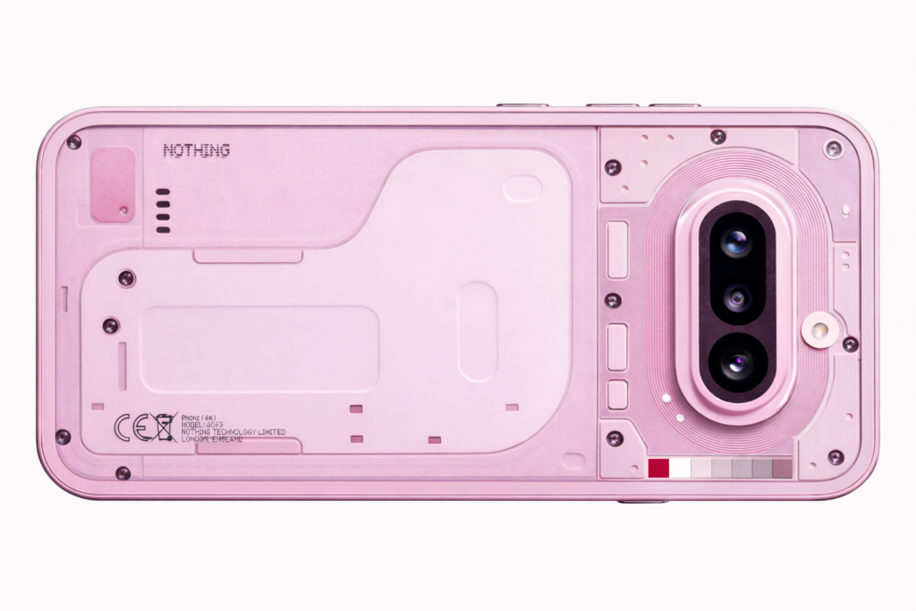
Nothing officially confirmed that the pink colourway of the Phone 4a will launch alongside the Nothing Phone 4a Pro on March 5 across global markets. Prior to this, the company had already showcased a white variant, staying true to its clean, minimalist aesthetic.
The introduction of pink, however, signals something different.
Unlike traditional neutral colours such as black, white, or grey, pink naturally attracts attention. It evokes emotion, personality, and a sense of individuality — themes that align closely with Nothing’s overall brand philosophy. More importantly, this is not just another shade added to a colour palette. Nothing has framed the pink variant as a statement about how technology should feel.
Nothing Phone 4a’s Design Identity – More Than Surface-Level Styling
To understand why this colour choice matters, it’s important to consider Nothing’s broader approach to product design.
Most smartphone manufacturers prioritize:
✔ Specifications
✔ Performance metrics
✔ Incremental upgrades
Design often becomes secondary — safe, neutral, and familiar.
Nothing, on the other hand, has consistently treated design as a core feature rather than an afterthought. The brand’s transparent aesthetic, distinctive glyph interface, and industrial-inspired hardware all point toward a philosophy where visual identity plays a major role.
In this context, the pink variant feels less like decoration and more like an extension of Nothing’s visual storytelling.
The brand itself has described pink not merely as a colour but as a representation of expressive and optimistic technology.
This is a subtle but important distinction.
Why Colour Still Matters in Smartphones
In an industry obsessed with hardware specifications, colour choices might seem trivial. But consumer behaviour tells a different story.
Smartphones are no longer just tools. They function as:
✔ Personal accessories
✔ Identity statements
✔ Everyday companions
Buyers increasingly care about how a device looks and feels, not just how fast it runs.
Colour plays a psychological role in purchasing decisions:
• Neutral tones → Safe, professional, mainstream
• Bold colours → Expressive, youthful, distinctive
By introducing pink, Nothing is tapping into the growing demand for personalization and visual uniqueness.
A Strategic Shift Toward Expressiveness
Nothing’s decision to introduce pink may also reflect a broader strategic shift.
Early Nothing devices leaned heavily into minimalist, monochrome aesthetics. While this established brand recognition, it also positioned the devices within a somewhat niche visual identity.
The pink variant expands this spectrum.
It suggests that Nothing is exploring a more expressive, lifestyle-driven positioning — appealing not just to tech enthusiasts but also to users who see smartphones as style extensions.
This aligns with a noticeable trend in consumer electronics:
👉 Technology as fashion
Marketing Brilliance – Turning Colour Into Experience
Nothing did not simply announce a new colour variant. The brand activated it through retail and experiential marketing.
Store-level campaigns, themed visual displays, and creative messaging transformed the colour launch into a conversation piece.
This reflects one of Nothing’s strongest capabilities:
✔ Creating attention without relying solely on specs
In a crowded smartphone landscape, visibility is everything. Many devices offer similar hardware, similar features, and similar performance. Differentiation increasingly depends on storytelling and perception.
By framing the pink variant as an event rather than a specification, Nothing ensures that the Phone 4a remains part of ongoing discussions.
Is This Innovation or Marketing?
This is where opinions naturally diverge.
Some buyers may view colour variants as superficial — aesthetic changes that do not alter performance or functionality.
Others recognize that for brands built around design philosophy, visual identity is itself a form of innovation.
Nothing’s approach blurs this line.
The pink variant is undeniably a marketing-friendly move. It generates headlines, social media traction, and consumer curiosity.
But it also reinforces Nothing’s core brand message:
👉 Technology should be expressive, not purely utilitarian.
Who Is This Variant Likely Targeting?
Colour choices rarely exist without a target audience in mind.
The pink variant could strongly appeal to:
✔ Design-conscious users
✔ Younger buyers
✔ Lifestyle-focused consumers
✔ Users seeking visual differentiation
✔ Existing Nothing enthusiasts
Importantly, Nothing devices often attract buyers who value aesthetic uniqueness over conventional design norms.
For such users, colour becomes part of the purchase experience.
The Broader Industry Trend – Standing Out Visually
The smartphone market has reached a stage of maturity where hardware improvements feel increasingly incremental.
Performance gains, camera enhancements, and battery upgrades continue, but visual similarity across devices has become more noticeable.
This has led brands to explore:
✔ Unique materials
✔ Distinctive finishes
✔ Bold colourways
✔ Experimental aesthetics
Nothing’s pink variant fits naturally within this landscape. Rather than competing purely on internal hardware, the brand competes on perception and identity.
What This Means for Potential Buyers
For consumers considering the Nothing Phone 4a, the pink variant offers an additional layer of personalization.
However, colour alone rarely defines a purchase decision.
Smart buyers should still evaluate:
✔ Performance requirements
✔ Camera expectations
✔ Pricing
✔ Software support
✔ Long-term usability
The pink variant enhances choice, but practical needs remain central.
If you’re comparing mid-range devices, check our detailed smartphone buying guide.
Final Thoughts – A Very “Nothing” Decision
Whether interpreted as a bold design experiment or a clever marketing strategy, one thing is clear:
👉 The pink variant successfully keeps Nothing in the spotlight.
In a market saturated with predictable launches, attention itself becomes a valuable asset. Nothing understands this dynamic well.
The Phone 4a pink variant is not just about colour — it’s about maintaining brand distinctiveness, sparking conversation, and reinforcing identity.
And in today’s smartphone industry, those factors matter more than many realize.
The Nothing Phone 4a pink variant proves that design can be both expressive and strategic.
About the Author
Hi, We are the founders of EveryTechHub. We share beginner-friendly guides on AI tools, blogging, and technology based on hands-on testing and real experience. 👉Read more about us.